Every Picture Is a Compromise
Lessons from the Also-rans
Most photography websites show the photographer's very best work. Wonderful. But that's not the full story of a creative life. If we want to learn, we'd better pay attention to the images that aren't "greatest hits" and see what lessons they have to offer. Every picture is a compromise — the sum of its parts, optical, technical, visual, emotional, and even cosmic – well, maybe not cosmic, but sometimes spiritual. Success on all fronts is rare. It's ok to learn from those that are not our best.
This is a series about my also-rans, some of which I've been able to improve at bit (i.e., "best effort"), none of which I would consider my best. With each there are lessons worth sharing, so I will.
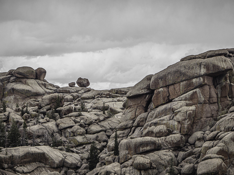
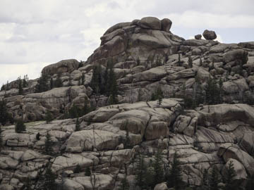
Original digital captureWhat I saw that I liked:Those two boulders perched on the top of the ridge. What I don't like in the picture:In my first attempt (above) I was trying to show them in the context of the mountain. They are visible, but the mounain overpowers them. What I learned:In the better composition (left), I eliminated the peak and therefore my eye is drawn more directly to the two boulders. I still have the feeling of "mountain" by the rock wall on the right side of the image. It isn't necessary to include the peak in order to get the feeling that these boulders are high up on the ridge. 2nd Chances: What I might try nextHere again, I used one of my favorite techniques — totally desaturating the sky so it looks more like gray storm clouds. I wonder if it would work better if I warmed up the clouds just a bit from neutral gray? |


