Every Picture Is a Compromise
Lessons from the Also-rans
Most photography websites show the photographer's very best work. Wonderful. But that's not the full story of a creative life. If we want to learn, we'd better pay attention to the images that aren't "greatest hits" and see what lessons they have to offer. Every picture is a compromise — the sum of its parts, optical, technical, visual, emotional, and even cosmic – well, maybe not cosmic, but sometimes spiritual. Success on all fronts is rare. It's ok to learn from those that are not our best.
This is a series about my also-rans, some of which I've been able to improve at bit (i.e., "best effort"), none of which I would consider my best. With each there are lessons worth sharing, so I will.
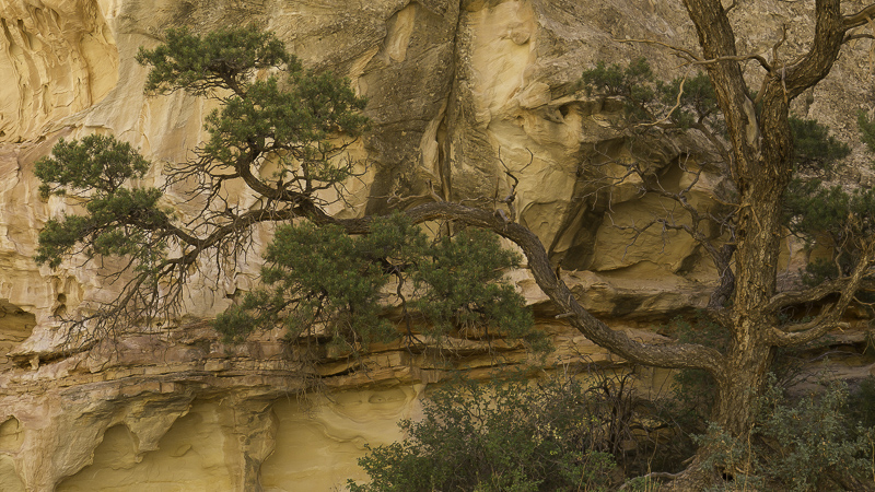
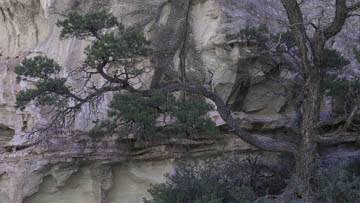
Original digital captureWhat I saw that I liked:The tree is what caught my interest. The colors are what discouraged me. What I don't like in the picture:Believe it or not, the image at left is a better rendition of the color I saw as I stood there. It's also rendered as "As Shot" in Lightroom. But isn't it too warm? What I learned:The above image (that's inaccurate) is the result of clicking on the "Auto" white balance. It looks more natural, but is actually very far off the "true" colors of the scene. Neither of these seem right to me. Maybe somewhere in-between would feel natural. I'll need to play with this image a while. As it is, these are both "losers" — but perhaps with potential. 2nd Chances: What I might try nextBTW, I tried b/w and that didn't work. |


