Every Picture Is a Compromise
Lessons from the Also-rans
Most photography websites show the photographer's very best work. Wonderful. But that's not the full story of a creative life. If we want to learn, we'd better pay attention to the images that aren't "greatest hits" and see what lessons they have to offer. Every picture is a compromise — the sum of its parts, optical, technical, visual, emotional, and even cosmic – well, maybe not cosmic, but sometimes spiritual. Success on all fronts is rare. It's ok to learn from those that are not our best.
This is a series about my also-rans, some of which I've been able to improve at bit (i.e., "best effort"), none of which I would consider my best. With each there are lessons worth sharing, so I will.
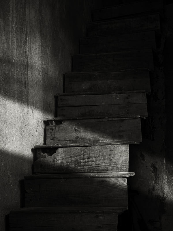
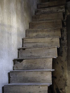
Original digital captureWhat I saw that I liked:Fun, but slightly intimidating, stairway in a village in China. What I don't like in the picture:The thing is interesting, but the light is bland. What I learned:I'm not above "orchestrating the light" in processing. I'm more than comfortable adjusting exposure and contrast, for example, so why would I hesitate to add a beam of sunlight that wasn't there? The trick is to make it look natural — which I hope I did in this image. 2nd Chances: What I might try nextFeathering those lines of transition are the key. I might play around a bit more with this one before I call it good. |


