Every Picture Is a Compromise
Lessons from the Also-rans
Most photography websites show the photographer's very best work. Wonderful. But that's not the full story of a creative life. If we want to learn, we'd better pay attention to the images that aren't "greatest hits" and see what lessons they have to offer. Every picture is a compromise — the sum of its parts, optical, technical, visual, emotional, and even cosmic – well, maybe not cosmic, but sometimes spiritual. Success on all fronts is rare. It's ok to learn from those that are not our best.
This is a series about my also-rans, some of which I've been able to improve at bit (i.e., "best effort"), none of which I would consider my best. With each there are lessons worth sharing, so I will.
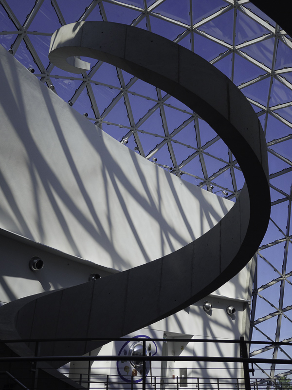
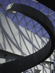
Original digital captureWhat I saw that I liked:This is at the Dali museum in St. Petersburg, Florida. What I don't like in the picture:I knew the basic composition I wanted, but in the above I missed that the edge of the architectural shape was touching the right edge of the image. Mistake. What I learned:Fortunately, I caught that visual merge when I chimped at the image in the camera. A simple recomposition along with a very slightly wider lens solved it. (The one above was shot zoomed to 22mm, whereas the one at left was shot at 18mm. A good example of why I much prefer zoom lenses for precise compositions like this one.) 2nd Chances: What I might try nextI'm tempted to desaturate the blue sky. Maybe. |


