Every Picture Is a Compromise
Lessons from the Also-rans
Most photography websites show the photographer's very best work. Wonderful. But that's not the full story of a creative life. If we want to learn, we'd better pay attention to the images that aren't "greatest hits" and see what lessons they have to offer. Every picture is a compromise — the sum of its parts, optical, technical, visual, emotional, and even cosmic – well, maybe not cosmic, but sometimes spiritual. Success on all fronts is rare. It's ok to learn from those that are not our best.
This is a series about my also-rans, some of which I've been able to improve at bit (i.e., "best effort"), none of which I would consider my best. With each there are lessons worth sharing, so I will.
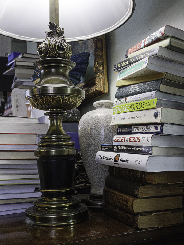
Original digital captureWhat I saw that I liked:Part of a project tentatively titles, A House Full of Books. What I don't like in the picture:The one above was my first effort. Nice. But, why not use the lamp to brighten the scene? Duh! What I learned:After this shot, I went around the house and turned on every lamp and light I could find. Then started the entire shoot from the beginning. Much better with all that extra light. I have always just used the light I found without adding any additional light. Maybe that's a mistake. Are there instances where more light would not be preferred? I need to think about that more carefully. 2nd Chances: What I might try nextThe more I've looked at this image, the more that blue box in the upper left, just under the lampshade, bothers me. Just need to turn that spot of distraction color to gray. |


