Every Picture Is a Compromise
Lessons from the Also-rans
Most photography websites show the photographer's very best work. Wonderful. But that's not the full story of a creative life. If we want to learn, we'd better pay attention to the images that aren't "greatest hits" and see what lessons they have to offer. Every picture is a compromise — the sum of its parts, optical, technical, visual, emotional, and even cosmic – well, maybe not cosmic, but sometimes spiritual. Success on all fronts is rare. It's ok to learn from those that are not our best.
This is a series about my also-rans, some of which I've been able to improve at bit (i.e., "best effort"), none of which I would consider my best. With each there are lessons worth sharing, so I will.

Previous image | Next image |
Original digital capture

Fog Week
Fog is one of the great tools in photography. Jay Maisel has it right when he said, "Never trust air you can't see." Whenever I see fog building in the landscape, I grab my camera and head out. This week is a celebration of fog and some ideas that make fog images work — and a few pitfalls to avoid.
What I saw that I liked:
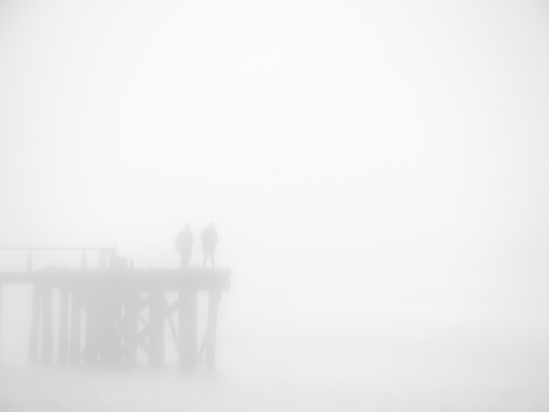
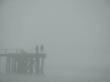
People in fog are always so evocative.
What I don't like in the picture:
A universal problem with fog pictures is that they fool exposure meters and white balance settings with regularity.
What I learned:
Remember that a camera analyzes toned with an averaging algorithm that puses everything to an average of middle gray. When fog dominates the tones like in this image, the exposure will bias to middle gray. Fog isn't middle gray — it's light gray. If you don't compensate in the camera (which should be the first choice) then you can expect to have to compensate in the processing. |
|


