Every Picture Is a Compromise
Lessons from the Also-rans
Most photography websites show the photographer's very best work. Wonderful. But that's not the full story of a creative life. If we want to learn, we'd better pay attention to the images that aren't "greatest hits" and see what lessons they have to offer. Every picture is a compromise — the sum of its parts, optical, technical, visual, emotional, and even cosmic – well, maybe not cosmic, but sometimes spiritual. Success on all fronts is rare. It's ok to learn from those that are not our best.
This is a series about my also-rans, some of which I've been able to improve at bit (i.e., "best effort"), none of which I would consider my best. With each there are lessons worth sharing, so I will.

Previous image | Next image |
Original digital capture

Fog Week
Fog is one of the great tools in photography. Jay Maisel has it right when he said, "Never trust air you can't see." Whenever I see fog building in the landscape, I grab my camera and head out. This week is a celebration of fog and some ideas that make fog images work — and a few pitfalls to avoid.
What I saw that I liked:
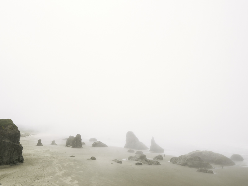
A foggy shoreline.
What I don't like in the picture:
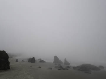
In addition to the exposure problem in yesterday's image, here is an example of problematic white balance. Fog is not purple/magenta.
What I learned:
Here again, you can expect to need to adjust coloration if your image is in color. I pushed the one at left to a warmer white balance which pushed the foggy "sky" toward pink. I've tried to neutralize that pink, but I'm not sure I've completely eliminated it yet — at least on my monitor. Might need to work on this a bit yet.
And, by the way, this is such a delicate balance to get the fog neither pink nor any other cast, you can expect to need to print this type of image with care. It might require several attempts before you get it right in the print. Soft proofing is simply not accurate enough to be reliable with an image like this. |
|


