Every Picture Is a Compromise
Lessons from the Also-rans
Most photography websites show the photographer's very best work. Wonderful. But that's not the full story of a creative life. If we want to learn, we'd better pay attention to the images that aren't "greatest hits" and see what lessons they have to offer. Every picture is a compromise — the sum of its parts, optical, technical, visual, emotional, and even cosmic – well, maybe not cosmic, but sometimes spiritual. Success on all fronts is rare. It's ok to learn from those that are not our best.
This is a series about my also-rans, some of which I've been able to improve at bit (i.e., "best effort"), none of which I would consider my best. With each there are lessons worth sharing, so I will.

Previous image | Next image |
Original digital capture

Fog Week
Fog is one of the great tools in photography. Jay Maisel has it right when he said, "Never trust air you can't see." Whenever I see fog building in the landscape, I grab my camera and head out. This week is a celebration of fog and some ideas that make fog images work — and a few pitfalls to avoid.
What I saw that I liked:
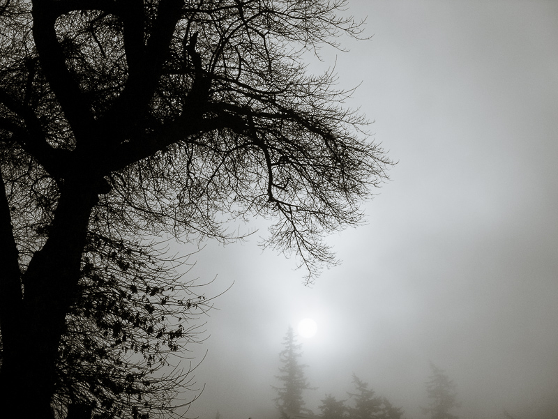
I just love the low sun visible in this fog.
What I don't like in the picture:
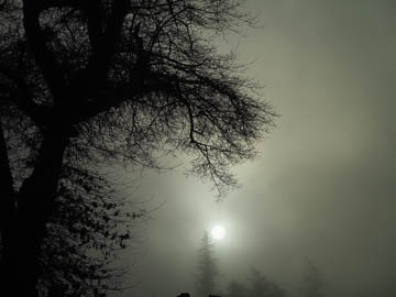
No idea where the green came from in the RAW capture above, but it's got to go.
What I learned:
This was one of the first images from early in my foray into digital photography. I first tried to shift the color balance of the above, but that didn't work. Then I tried a conversion to grayscale and that was better, but a bit bland. I finally tried a split-tone which you see here on the left. The tree is slightly warm and the fog is slightly blue. On my laptop, the sun looks slightly pink, but it prints as paper white, which is what I was hoping for. |
|


